Tweetbot 3 Review

I use Twitter everyday. It’s my single most enjoyable source of information, and a great way to (excuse the cliché) socialise with the community. So it goes without saying that I spend a lot of time using a Twitter client on my iPhone. Up until recently, I’ve been using Twitter’s official app as my go-to client. It had been doing the job, but started to feel a bit too basic and I felt like a change is in order. And what better time to make that change than with the release of Tweetbot 3 for iPhone?

I hadn’t really used Tweetbot before. I had checked it out and read a lot about it, but never actually used it instead of the official Twitter app. But with the release of the new iOS 7-ified version of Tweebot, and after sensing a lot of excitement on my Twitter feed, I just had to see what all the hype was really about.

When you open up Tweetbot, it introduces you, in a really slick way, to a few of its unique features. Swipe right-to-left to view a tweet in detail, including the retweets, favourites, and replies that it received. Tap and hold on the last two navigation items to change the page assigned to those items. Tweetbot is fueled with tiny, impressive tweaks like so.

Tweetbot Timeline

Tweetbot Timeline

The first thing you notice when you start using the app is how the avatars are all cropped into a circle, which is something that, I believe, has been giving a few iOS 7 apps a really nice touch.

As you start getting used to the app, you really start appreciating how everything is built. The developers really considered everything when coming up with the UI, and it shows. Every single functionality is put right in its place.

And also, the app is sexy as hell. One place where that really shows is the new profile pages. I could honestly (and might have, at some point) stare at a profile page for hours. When you enter someone’s profile, their header image is displayed right behind their avatar and bio, with a slight blur applied to that image. But, as you gradually scroll down, the avatar and bio start to fade out, and the header image starts getting more and more clear. The resulting effect is fantastic.

Profile Page

Profile Page


Profile Page (Scrolled)

Another kind of unique twist to the app is how images are handled. To dismiss an image that you loaded up you swipe it away in any direction, and it feels like you’re actually swiping away a piece of paper. It’s a really tiny detail, but it has a huge effect on the app’s experience. Also, you can view Instagram images right from the app, which is a huge advantage.

Swiping away a photo

Swiping away a photo

To conclude, the overall feel of the app is immensely fluid. I don’t just use a Twitter client as a gateway to people’s tweets, but I now use a Twitter client to also enjoy the Twitter client itself. Tweetbot is definitely not overrated. It is the best Twitter client out there.

Buy Tweetbot from the App Store here.

Tagged , ,

Introducing Circulr

Circulr Icon

Circulr is a little app that I made in a couple of days to help users easily crop their photos into a circle. The concept is pretty simple, and so is the UI.

The reason I made the app is because I’ve been loving how some apps, like Instagram and the new Tweetbot, have been using circular avatars instead of regular old square avatars (meh, squares). I turned my own Twitter avatar into a circle using Photoshop, but that method is too tiring to become a thing. And thus, Circulr was born.

Circulr is free on the App Store. You can follow me on Twitter for any additional questions.

Your support and feedback would be greatly appreciated!

Tagged ,

Icon Pick: Analog Camera

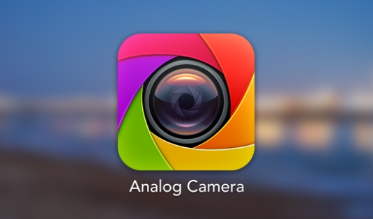
Analog Camera Logo

I’ve always been hugely impressed by software icons. They manage to describe the objective or functionality of a piece of software through a very limited, yet hugely potential way. ‘Icon Pick’ is going to be where I share those icons that really grab my attention.

Analog Camera is an iOS application created by Realmac Software – the same people behind the amazing to-do list app Clear – that enables users to take extremely quick and beautiful pictures through a very simple and slick user interface. The app’s icon is a great depiction of exactly that.

The icon itself is extremely minimal. It’s simply a representation of a camera’s lens, which just screams photography right from the start. But that’s pretty expected from any photography app’s icon. Even the old, default iOS 6 Camera app had a camera lens as its icon.

What really grabbed my attention is the outlining aperture. The variation of colour gives the users a huge sense of customisability, be it through filters or through multiple camera modes. But, even more importantly, the outlining aperture gives a huge sense of beauty, which subconsciously pushes users to believe that photos taken from this app are going to look absolutely beautiful.

Lastly, the very subtle reflection of light on the lens sends the most powerful message, at least to me. The amount of detail put into that was definitely not necessary to make the icon amazing. However, when one realises just how much detail was put into that, then he/she would know, and, more importantly, greatly appreciate the amount of detail put into the whole application.

Analog Camera is a beautiful, slick application, from start to finish.

Tagged , ,

Flipcase: Gaming With The iPhone 5c Case

I just stumbled upon this video, and I thought that this was incredibly cool. Flipcase is a game that takes advantage of the new iPhone 5c case in an interesting and really creative way. Here’s a gameplay video that shows this game off:

Tagged , ,

Simplicity: An Art

FlipboardBack in the beginning of 2012, I made the decision of purchasing an iPhone 4S. Just like any other regular person, I quickly began cramming it with apps that I thought would be enjoyable.

One of the easier choices was Flipboard. I loved the idea of a social, digital, and customisable magazine right at the tip of my fingers, and the abundance of features and categories was great. What stole my heart, however, weren’t the features, or the customisability, or even the idea of the app itself. What stole my heart was the simplicity of it all, and how simplicity beautified communication.

It all begins with the actual app icon. The slightly textured crimson background serves as a wonderful throne to the even more wonderfully-designed part of the logo: the letter “F”.

The typography chosen is amazing. The design of the letter is perfectly chosen, and one could stare at it for hours for the mere purpose of appreciating the designer’s vision. There was something else that also grabbed my attention. The “F” looks like it’s made up from three pieces of paper stacked on top of each other, which subconsciously give the user a sense of what’s to come: content.

You then carry on to tap the dark red icon and the app smoothly launches. The first thing Flipboard does is prompt you to, well, flip. This is how, using just one word and a beautiful UI, Flipboard’s designers managed to introduce us to the core mechanic, as well as the feel of the app.

Many other aspects of Flipboard stick to the principle of simplicity, and that’s probably a major reason for the app’s success. One subtle ribbon gives access to one of the best search systems in an app, and the process of discovering and subscribing to the huge number of magazines available right now is made incredibly and wonderfully simple.

Flipboard is just one of the apps that take advantage of touchscreens in order to offer a beautiful experience. I could honestly go on for hours, discussing how iA Writer made writing as simple as it gets, or how Clear took advantage of gestures to make one of the most usable to-do applications out there.

The app ecosystem is growing very rapidly, yet the principle of simplicity over a cluster of features is not yet applied by many. Skeuomorphism is still abundant and is standing in the way of true UI innovation a la Clear. As soon as the art of simplicity is applied, however, people will finally appreciate its masterpieces.

Tagged , ,

PlayStation and indie games: a love story

PlayStation and indie games: a love story

But there’s something else at play. It’s not just that Sony is streamlining its process and offering up financial incentives to studios — it’s also being very good at simply being open with developers and, perhaps more importantly, actively seeking out new and interesting experiences. “They’re people who really get games, and get developers, and are as passionate as we are,” Johann Sebastian Joust developer Douglas Wilson said at the same event. JS Joust, a game that uses PlayStation Move controllers but requires no screen, was part of the Sportsfriends collection, a Kickstarted-bundle of local multiplayer games that also received support from Pub Fund. It’s about as far away from the high-octane action on display at the PS4 announcement as possible, and it’s a game that is coming to PS3 simply because someone at Sony saw it and liked it. “We go out there to look for great content to partner on,” added Boyes.

This is probably one of Sony’s smartest decisions. Indie games aren’t just a temporary thing. Indie games are here to stay, and to finally bring innovation to the gaming world. Sony’s decision to give them such huge focus is the way to go.

The Dying Thrill of Reading

Image I’ve been buying a number of new books recently. These range from highly recommended reads such as George Orwell’s Nineteen Eighty-Four, to new and shiny releases such as J.K. Rowling’s The Casual Vacancy. I had gotten my reading chair set up, my instrumental tunes ready, and my time freed up. It was going to be an incredible cultural experience, and it was going to be great.

Book after book, I opened them all up, getting more excited after each sniff of that first, clean page. The first few paragraphs were very exciting. Getting to know the characters, visualizing the world they live in, feeling the mood that’s being conveyed. And how many of these books have I completed? None.

The thrill was there, but it was non-lasting. This could be comparable to skydiving (Well, I assume). The jump is breathtaking. The excitement fills you up. You are fueled by an adrenaline rush like no other. And then, nothing. After a few seconds of awe, it all fades. The jump is definitely unforgettable, but the rest is just not as compelling.

I still remember how I was a few years back. I used to hold up a book, and never put it down unless I reached that satisfying final page. Now, I spend all my free time watching TV shows while keeping my laptop on standby to download, well, more TV shows. And I doubt that I’m the only person who’s been facing this problem.

But why? Societies develop and change everyday. Unfortunately for us, we now live in a society where we have so much to do, and very easy ways to do them. On the surface, that doesn’t sound so bad. Having easy access to a whole world of time-consuming activities sounds quite enjoyable, actually. But this becomes a problem when the time-consuming activities are also slowly eating away our brain cells. We all hear beautiful stories about technology, and how technology is making our lives easier. And, if you even just barely know me, you’d know that I appreciate technology more than most people (maybe a little too much). But if there’s one thing I really love about technology today, it would be people’s attention to its true innovation. Because, as we all know, when the personal computer was first being introduced to the world, the true potential that its founding fathers saw was in flinging unjustifiably bitter virtual birds through the screen.

Not only are people missing out on the beauty of technology, but cheap, uninnovative mobile games and services are sucking people into a world where procrastination is key. And, to be honest, I’m as much a victim of the black hole of Temple Run as any other person.

The virtual world is taking over, and it’s not pretty. People, myself included, should start venturing into the world where technology’s true potential hides. In that world, technology makes our real-life tasks easier and more enjoyable, instead of trying to replace that life. It is a world where people download apps like Evernote to jot down ideas that they get while watching the world around them, or an app like Foursquare to discover new places instead of to gloat about where they are and who they’re with. I’m probably a hypocrite for writing down all this, but I guess that’s the reason I did write this. At least I know that a part of me still prefers culture over mindless fun. I’ve just downloaded Goodreads, and plan on reading and discovering new books in the months to come. I don’t really know how that will go, but I’ll just hope for the best.

Tagged ,

The Mind’s Playground

My name is Samir Ghobril and I’m 17 years old. I got into coding and the sorts three years ago when I wanted to create a video game (poor, naive 14-year-old me) and slowly ventured into the beautiful world of web and software development. Generally speaking, my software development plan is:

  1. Get an epiphanic idea
  2. Start implementing idea
  3. Alter and improve idea until it is almost perfected and complete
  4. Give up on the idea

Not a really good plan I assume, but my low self-esteem in my own creations is to blame. The first “big” project I worked on was a document-organisation web-app entitled Cliproid. A few months later, the site was complete, so, naturally, I completely discarded it. After that, I prototyped a few other web ideas, but nothing was convincing enough for me.

A little later after that, I got into game development. I spent about 6 months working on an autorunner iPhone game, and, despite all my friends’ encouragement, I gave up on that one too. I also prototyped a few other ideas in the months that followed, but never got myself to finish any of them.

And now, three years after my initial encounter with programming, I got back into web development using the incredible Rails framework. I’ve set up a new Rails project and I’m probably halfway through completing the site. It’s by far the best project I’ve worked on so far, but my motivation is rapidly decreasing. That’s why I came up with two solutions.

The first solution is enrolling myself in a computer science competition held by the Lebanese American University. I have a deadline, which is around the beginning of March, and that will probably drastically increase my overall productivity.

The second solution is this very blog. While I don’t predict many users will be reading my posts, the idea of publishing articles about my progress will help in making my work on the site much more enjoyable and exciting.

Finally, I believe that everyone and everything needs a playground, and the mind is no exception. Pixel Chug will be housing every piece of opinion that comes to mind, no matter how random the topic.